Truth be told, I ditched one of my Twitter accounts, then had a job change, a relocation (that technically still isn't completed) and a bunch of other life shifts.
As part of these changes I started looking into printing my own checks. This is something I'd never done. I hardly write checks. It's only for those cavemen companies that don't take plastic and can't take cash where I'm forced to either pony up for a money order or write a check. Well, the current account I have makes you go through an Act of Congress to get the first batch of checks, and after three botched checkbook mailings, I decided to just do my own thing.
After researching - and deciding I wasn't going to pay so much for Quicken again - I stumbled on Checkeeper.com.
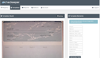
When you register your account, you're presented with the window above, where you're asked to enter your checks. There's also the templates area, which has one that is generic and can be tweaked. The problem with this, of course, is that if you're planning to print your own checks, there's simply no way to get everything to line up clean. There's a tool to upload a picture of one of the blank check pages, but nothing lines up. It's off by roughly a quarter of an inch and there's nothing you can do about this.
As a result of this, you'll be spending a LOT of time and wasting a lot of check paper just to get things to print correctly. Check paper isn't cheap. I bought a box for $23 of paper I didn't really care about just so I could practice - and ended up wasting 10 of them, still not getting it just right.
The real issue is that:
- The onscreen layout will never match your paper stock even if you upload an image. So you'll have to align things differently and use trial and error to get it right;
- The template designer layout will not match the print preview. So while you might get it to a point that the template looks perfect, when you go to print preview it will look screwed up;
- The template designer was written with dynamic sizing. This means that if you don't maximize your window, everything gets screwed up and the problem is even worse. No multi tasking for you unless you have dual monitors, which I don't at home;
- You can't control fonts of individual elements, only the template at whole. So you can never make a check look like a check; and
- Certain elements are size limited despite being smaller than the template. So when trying to draw payee lines, for example, you can't draw them the full width of the template. You have to build two lines and connect them. That's fine on the template, but when you go to the print preview, it clearly shows them misaligned, and there's nothing you can do.
To put this in perspective, it took me 15 hours to get to a point a check was printable via a drag-and-drop UI. That's simply unacceptable, since we're only talking about personal checks here. (For the record, I not only work in IT, but I work with software development. There had to be literally zero QA done on this before release.)
 |
| Seems legit. |
 |
| Err, that looks terrible. |
In summary, this is a tool that looked promising and was cost effective. Unfortunately, there are just too many fine points missing. Some fine points for the developer:
- You offer a "Background" but it assumes a corporate check. How about, create one for personal checks? Since you know, most businesses aren't going to be using this type of service, they'd just use their ERP app?
- Speaking of the "Background", why do you have a border? Are you assuming that a person is printing this on blank white paper or something? Most check paper already has bordering. It's redundant and makes the line up process even worse.
- I know there's no way you can calibrate to every type of paper possible. I get it. Which is why if you just fix your capture tool, we can capture the check paper properly. It should auto correct, auto crop, straighten, etc. These are standard algorithms. Or at least pre-program the standard check paper stock that's out there.
- Allow element-level font changes. Again, this is standard assumption.
- Allow image imports. That way, I can just design the background the way I want as a transparent PNG, upload it, then I can align it without having to build lines or "MEMO" static text.
- Why is there a field length limit? There's too much wasted space on the left and right.
- Why don't you have a horizontal rule line as a drag item? Obviously lines are optional, but if we're trying these look official, surely this is a no-brainer?
- Why can't we fill in the bank name and address data and then have those as drag items? Same with my address, you already have it on my profile, why do I have to enter this manually as static text?
- If you double click into a static text field too much it turns into its code equivalent. Clicking out deletes all text. You're forced to delete the field and rebuild it.
As a side note, I did email the developer telling them much of this, but then they just stopped replying to my email. Most companies that really want to succeed, listen to feedback like this that's offered for free. Oh well.
My recommendation: Until they advance this tool much further than where it's at, I suggest you just buy Versa Check or Quicken or go with a different online solution.
